

La Francesita French Bakery
A local bakery looking to grow their audience online was in need of a revamp to their main website to better reflect their identity. In doing so, the revamp set out to compromise on issues both the users and the business owner faced for a more streamlined overall experience.
Roles
Team Size: 6
I assumed the following roles designing this website:
• UX Designer
• UX Researcher
• UI Designer
Deliverables
Responsive Design, High-fidelity prototypes of both desktop and mobile websites.
-
Competitive Analysis
-
Value Proposition Canvas
-
Customer Journey Map
-
Storyboard
Project Specifications
Duration: 3 weeks
Tools:
-
Figma
-
Miro
-
Google Drive
-
Photoshop
-
Clip Studio Paint
Overview
In a world that increasingly uses the internet in order to review places before visiting, La Francesita struggled with maintaining its online presence. The menu was inaccurate, the site was lacking in brand identity, and was outdated on all counts. The website revamp introduced several new and retouched features: a visual menu that was easy to read and navigate, a reservation feature, and an about page. All of which needed to be fixed to bring the site into the modern era.
Problems
-
Items would frequently be out of stock, disappointing the customers.
-
Service was slow due to staff shortages
-
The current website did not accurately reflect the services the bakery can provide, such as curbside pickup or delivery.
Proposed Solutions
-
A means of ordering, a pastry online for in-store pickup.
-
Advertising that the bakery was hiring on the website.
-
Revamping the website so that it would more accurately show information about the bakery itself.
I. Research
1
Stakeholder Interview
Conducted an interview with owner/stakeholder to get insights from the business perspective pain points and needs. Also we used the method of observation to detect patterns in user in - person experience
9
User Interviews
Conducted 9 in - person interviews with new and old customers visiting the restaurant to get a fresh, in-the-moment perspective
26
Survey Responses
-
Largest age range of participants: 30-39
-
Discovered: Word of mouth or drove by
-
Restaurant website used mostly for:
-
viewing the menu
-
make online order
-
-
User visits restaurant most about 3-4 times a year or special occasions
8
Hours of Observation
Observed pain points in real time, watching customers leave due to a long line or slow service, or get upset due to an item they wanted being out of stock.
"I don't trust a site that doesn't have pictures."
- User during an interview.
Findings
In between all of our research, I noticed an intersection between the goals and needs of both the stakeholder, and the users. I ended up calling this intersection "the sweet spot" and began to use this as my target for all of my solutions.

Understanding Who the User Is
The first thing I did coming back from our in-person observations, and interviews, was craft an Affinity Diagram to synthesize all the research we had just done, for both the stakeholder and the user.


From there, I was able to determine our User persona and our stakeholder Persona, both of whom had needs to be met, and both would end up being users of the site from differing perspectives. The question then became: How can I make both Rick and Sabrina happy, both of whom want to connect more with their community, and how do I form solutions that balance the goals of both the business and the end user?


Understanding the Competition
A competitive analysis was also put together, so we could understand what edge the other local businesses had over La Francesita, and why people would choose them over the beloved bakery.

II. Definition & Ideation
After figuring out who our end user is, it became easy to uncover the main pain points for the participants involved in the case study. We made a Customer Journey Map for our persona to ensure we were accurately addressing Rick's, and therefore the customers', goals.

Caption: The situation described in the customer journey was one we had observed occur during our 8 hours of observation.
From there, it was easy enough to determine the ideal situation for the customer, and I drew out this storyboard.

It was time to start brainstorming. To narrow down on possible solutions from our brainstorming, we created a value proposition canvas, and a feature prioritization matrix.


The Palmier Problem
We knew based on research and observations that people were struggling to buy Palmiers (a star item) because they:
1
Didn't know when they were ready or sold out and sometimes arrived to the bakery to get the news.
2
They had to call and sometimes staff couldn’t answer because they were busy.
3
People arrived in-person made the line to order and at the register got the news that there were no more palmiers.
We came up with the idea of Palmier reservation online to alleviate the frustration of the customer and also assist staff to have more organization with how many Palmiers they were doing for the days to come reducing waste and gaining more profit. At first, we had it set up for same-day pickup, but as we spoke to our stakeholder, we learned it would be best to set it up for two days in advance reservation.

Restructuring the Site
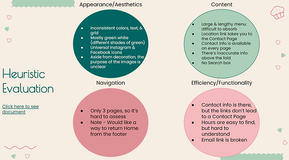
After we ideated on probable solutions, we performed a heuristic analysis of the current site, looking to see for ourselves the site's current structure, and determine what information needed to remain on the site in the redesign, and what needed to be changed. We also wanted to experience for ourselves what the user's struggles were.

The next thing we needed to do was figure out the natural progression of the user throughout the site. It took us some time, but now that we had the purpose of why a user would use the site (i.e: to browse the menu), we were able to bring it to three main user flows, and thus were able to restructure the site as well.

III. Prototyping


With our new sitemap in place, it was time to figure out our responsive web design. We worked on many different layouts of our home page to determine what type of layout we wanted for our new site. Each pass of our design went through a phase of testing.
For the wireframes, we conducted 8 usability tests to ensure the site could be navigated on both desktop and mobile. Each test was successful, and we moved onto our mid-fi design, nailing down aesthetic choices.

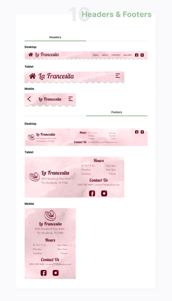
The first thing we did was study the site design of other famous French bakeries to really bring a touch of Paris to The Woodlands. Some of these inspired our wireframe setups, and we decided to move forward with the awning in order to really drive home that you're stepping into a bakery, even online. As such, we crafted a style guide that would suit the friendly atmosphere. We knew one thing we majorly wanted to include was pictures of the food. In our research, we found that to be a major complaint among the local clientele.


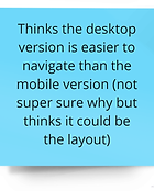
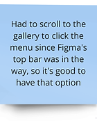
After constructing the mid-fis, we conducted another round of usability tests. While all the users were able to complete all the tasks, there was some confusion between navigating this version of the site, as well as the mobile version of the site. Mostly, the mobile site required some little tweaks here and there as we moved from Mid-Fi into Hi-Fi. The mobile site had some confusing aspects that lead to issues for the users. The results are as follows:


All of this information brought us to our High Fidelity design, which sought to emulate not only the colors of the restaurant, but immerse the user in the style of a French bakery. As we worked, we ensured that the design was responsive, working on desktop, mobile and iPad.

IV. Conclusion
Further Improvements
-
Spanish translations for the website and menu.
-
Reward points program for loyal customers.
-
Display for busy/high traffic times in the restaurant.
-
Google maps pin for the address.
-
Implementation of site changes with a developer.
Lessons Learned
-
Making early assumptions, especially with our proto persona, skewed our interview questions to not account for newer customers; in the future, we might make two separate proto personas and gear our interview questions accordingly.
-
We assumed in the beginning that the stakeholder would want to be more involved with maintaining the website, so we had to change a lot of features in order to adjust for a more low-maintenance build.
